More Audience feedback on our products

We have now created our products and are aware that we need audience feedback for our evaluation questions. Below are feedback on our products. We asked people from our target audience to give us feedback on what they think of our products.

The questions we asked were:

Music video:
What do you think of our music video in general?
Do you see representation of britishness?
What do you think of the camera angles and shots?
What do you think we could have improved?
Do you think its fits into an RnB genre?

Digipak and Magazine Advert:
What do you think of the overall products?
What do you think we could have improved?
Do you think it fits into an RnB genre?

Feedback:

Feedback
Above is feedback given to us online. We asked this girl to give us feedback as we thought she is suitable as she is in our target audience and she understands the rnb genre. This feedback was given to us recently after we finished our final drafts of products.
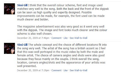


The feedback above was given to us through facebook. A member of our audience answered our questions to give us feedback. This feedback was given to us shortly after we had finished our final drafts of our products

We also had recorded feedback for our music video which was voice recorded.


This feedback was given to us after we finish all of our products, it will be helpful for our evaluation as one question is based on audience feedback.

Feedback for Music Video

We had completed our Magazine Advert and our Digipak and now we needed to focus on editing for our music video. We intended to use Imovie as we have had experience on this software before when we went to brentford clc.

We uploaded our footage on imovie and downloaded the song and put it onto imovie as well. We intended to follow our storyboard but we did not use some of the shots we included in our storyboard so we couldn't follow our storyboard exactly the way we wanted. But we established what shots we thought were important to follow to the storyboard which was mainly the beginning and the end scenes (even though we changed some of out shots, for example, it did not begin with the girl lieing on the bed she was lieing on a sofa instead)

We began editing from the beginning finding relevant shots. The hardest part of editing was trying to get everything in sync, we had to make sure that it looked like the girl and boy were saying the words at the same time of the music.

While editing we needed to consider the pace of the music and make sure transitions and effects went with the music, as well as cutting speed.

Below is a youtube video of our first draft...


The sound was a bit messed up due to a problem on Imovie. Ignoring this issue we recieved feedback from our group and they explained to us what they thought was good and told us what they think we should improve.

We recieved feedback from our class on a particular part of the funfair scene when the main singer and featuring artists were walking with 2 girls. We were told that the scene was random because the girls just came out of nowhere. It wasn't relevant to the rest of the music video as the were not introduced before that part.


Another comment made was that some of the male part were not in sync. Although he was saying the right thing, the way the mouthed the words make it look out of sync. We tried to sort this problem out by editing over these parts, we saw an improvement.


We were also told that the end part when the girl emphasises her singing abit more was not shown in the music video, we were told that the female should have put more emotion into it. However our group did not see this was such a big issue so we decided to leave it the way it was.


Below is a youtube video of feedback from shaan. We earlier interviewed him in a group before we made the music video for audience research. His comments were very useful to us.


Taking this feedback into consideration we decided that we needed to make a few changed to our video. Below is our improved version of the music video...


The sound was still messed up. We found out that this problem occured when we changed the speed of clip. However we were able to fix this problem after and we also recieved more feedback on this improved version.


After hearing feedback from harmit we established that there was not many changes we needed to make apart from sorting out the final sound. We also established that we managed to portray Britishness in our music video in scenes such as standing outside bigben with the london tour bus and taxis/police cars.


After considering feedback and making sure everything was in sync we have made our final version of breathe easy music video...


Here is evidence for Editing on Imovie

Editing Blog Work

Feedback for our Digipak and Magazine Advert

We had recieved audience feedback from our media group on our Digipak and Magazine Advert. Feedback is useful as our audience for our digipak is mainly aimed for people our age.

Good Things said about our Digipak:
- It looked professional
- Front and back cover matched
- Matched well with the song
- Stuck to the colour scheme
- Inside panels matched


Bad Things said about our Digipak (possible improvement)
- We needed to make the special features on the digipak clearer
- Inside panels were a little bit too plain, should include an inspirational quote from artist inside
- the text of on back cover saying the song names included in the album did not go with the digipak


Magazine Advert- good things:

- It matched the digipak
- Same colour scheme
- Everything looked clear on it

Bad Things:
- Make the size of the magazine advert bigger


Changes:

The digipak Backcover

Our group thought that we needed to change the text of the backcover and also make the digipak special features alot clearer to make it look like a digipak and not a normal cd/album.

We changed the back cover twice.


The first change this not get positive feedback as we were told that the track timing did not line up in a straight line and the text looked too bold.


We then changed the font of the text again and we also changed the digipak features, making it clearer that it was a digipak and not just an album. We did this by saying it was a cd/dvd and to insert it into a dvd player to view music videos.

This is our final back cover...


We decided not to change to inlay and keep it the same, accept to add an inspirational quote and to also add the digipak features inside as well.


We further developed this digipak by rearranging the text. It now looks like this...


We made no changes to our magazine advert as we felt like we did not need to.

Final 4 Panels and Magazine Advert


Making Magazine Advert

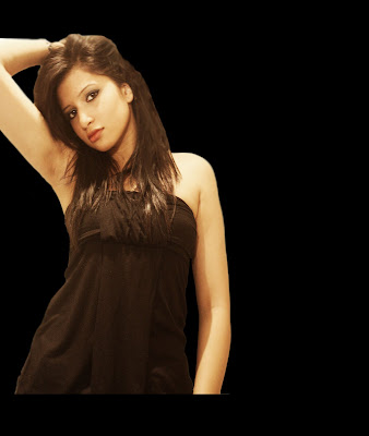
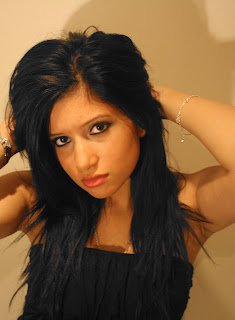
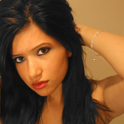
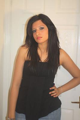
The picture that we have decided to use for our magazine advert is this...


We want to use this picture on a black background and put it on the side of the page.

We have edited and adjusted the image to make it look clearer using the skin perfecting techniques again such as the blur tool and the smudging tool.
We then erased the background, copied and pasted it on a new black background. We positioned it to the side.
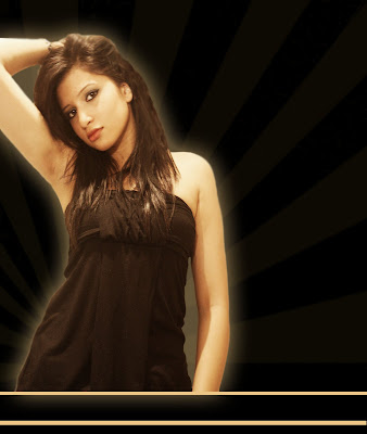
This is what it looks like so far.


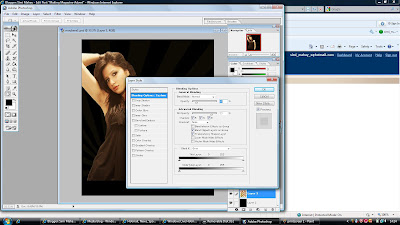
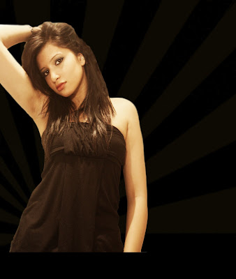
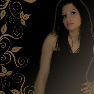
We then found an image to blend into the background so it wouldnt look too plain. It also draws attention to the artist image and the background looks like she (me) is shining. We blended the image into the black background and adjusted the opacity to how we liked it.


This is what it looks like so far.


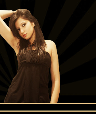
We then added 2 lines at the bottom of the page. This was because the photo of the artist is not touching the bottom of the page and it looks slightly odd. But we didnt want to move the position of the picture as we liked it there. We decided that we would put the 'out now' at the bottom of the page so we added lines to position where it would go. This is what it looks like now...


We thought that the artist image looks abit bare and we wanted it to stand out more. So we added an outer glow to the image.


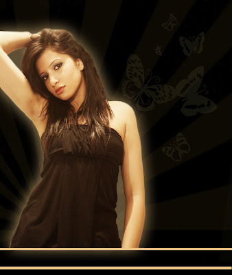
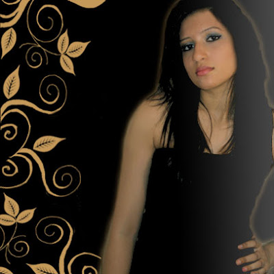
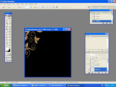
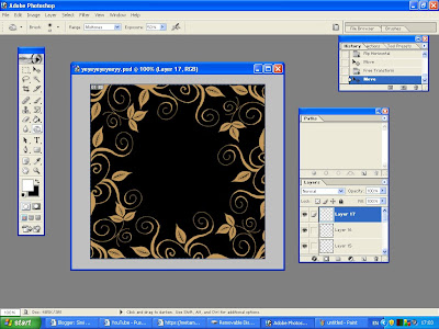
We thought that the magazine advert should match the digipak abit more so we added butterflies and blended it in the background of the magazine advert on the side, which looked like this...


Now we had to add text to the magazine advert. We needed to include the conventions of the artist name, album name and when the alum/digipak would be release.
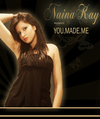
We used the same text that was on the digipak cover but we changed the colour to cream/beige. We positioned at artist name and the album name at the top of the magazine advert. We wrote 'Naina Kay presents You Made Me'.


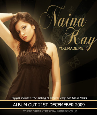
We then added when the album would be released at the bottom of the digipak, a wesite and what the digipak include.
This is what we ended up with, our final magazine advert...

Making Digipak

Below is a presentation i have made showing step by step what we have done to make our digipak.

Making Our Digipak1

After doing this we decided that the album cover looked abit dark and didn't match our genre which was RnB music. We decided that we should make the album cover more simple and add more neutral colours. From researching digipaks from other artists like alesha keys, estelle and leona lewis we decided to start from the beginning with producing a new digipak cover.

The picture we started with was...


We decided that we wanted to keep the background the same but just crop the image to the right digipak size. The background looks looks neutral like we wanted. We then used skin retouching techniques to make the skin look smoother and take away dark circles from the eyes.


This resulted in the image below...


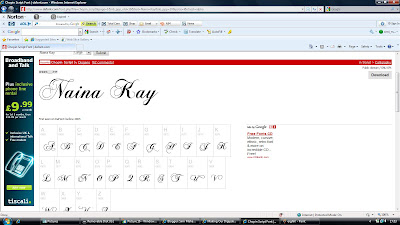
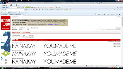
We then needed to add the artist name and digipak name to the digipak. We decided that we totally wanted to change our font to something different. We wanted to add patterns to the font. We wanted the artist name font to stand out and maybe add a butterfly or star as part of the design. We found a scriped font on dafont.com that we liked.


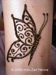
We found this butterfly and added it to the font we chose as a design. We erased everything apart from the butterfly pattern.


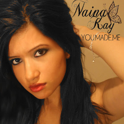
This is what the overall design looked like.

We then used a basic font for the album name 'you made me'.


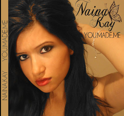
The front cover so far looks like this...


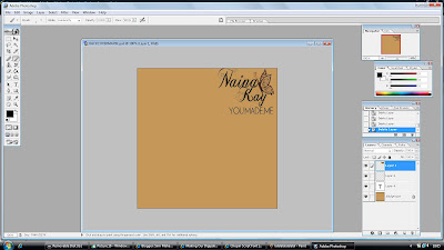
We then focused on the spine. We wanted to include a spine because we felt it was necessary to include one. We just added basic front from the printscreen above and pasted it vertically across. This is what it looked like...


Back Cover

We wanted to make the backcover simple and just add basic pattern. Because we used a butterfly in the font we wanted to use this in the design aswell. We also wanted to blend the design with the background which would be the same colour as the background on the front cover.


The image above shows that the background is the same colour as the front cover and the font is positioned in the same place as the front cover.


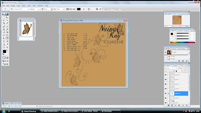
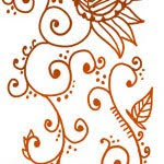
We then added the butterflys and blended them into the background. We also added a swirly pattern. Below is the picture that i used to get the swirly design from..


We made the patterns darker and croped a certain part and added it to the background as part of the butterfly design. We also blended this in so you could read the text of the song names.

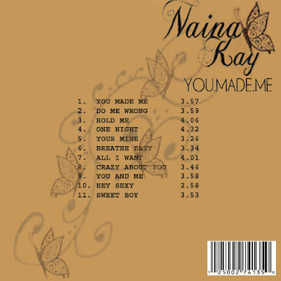
This is what the backcover looks like so far...


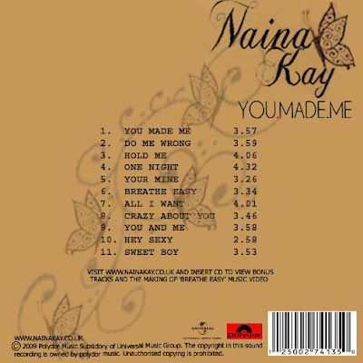
We have also added a barcode which is needed on the backcover which we found out from research. We also need to add record label logo's and album information. Our record label was polydor records. We added the logo of our record company and we added text at the bottom saying

' visit nainakay.co.uk and insert cd to view bonus tracks and the making of breathe easy music video'.

This is part of our features of our digipak.

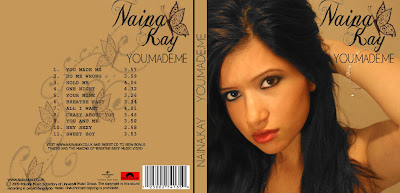
This is what our final back cover looked like.


Inside Panels

From our research we have found that inside panels always relate to the outside cover of the digipak. We decided that we wanted to include a picture for one of the panels atleast and keep the other one simple designs.

The picture that we intended to use was this...


This is why we chose this picture...

Picture 1

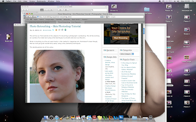
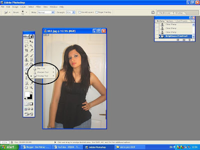
We adjusted the picture slightly to make it look more professional for use in a digipak. Firstly we made the face look smoother by using the smudge and the blurr tool but only where it was needed.


The circled area in the printscreen above shows the tools that i used such as the blurr tool and the smudge tool.

We then used the clone tool on areas that we thought it was needed. The point of this tool is to clone areas of an image and apply them elsewhere on that same image. We wanted the hair to cover the ear more on the image so we used this tool here.


The printscreen shows the clone stamp tool and what difference it has made to the image.

We then brightened the image slightly to make everything stand out more and look brighter.


This printscreen shows how we got the the brightness control tool.

Below is what the final image looks like...


We then wanted to get ride of the background because we knew that we wanted to add the image onto a black background and blend it into the background.


Above shows the tool that we used to get rid of the background easily without having to erase individual parts carefully which would have taken ages to do.

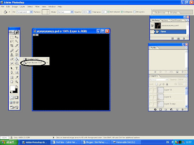
We then opened up a new window that was the correct size of the digipak. We made the background black because we wanted to use reverse colours of the front cover and backcover so instead of using beige as the dominant colour we used black.


Above is a print screen of the tool for the background, you select the colour you want and the paste it on the layer.
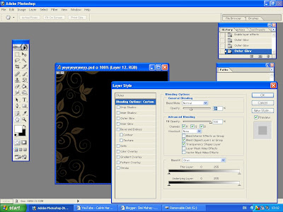
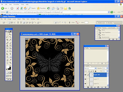
We then got a pattern and blended it into the background. Below is a print screen of how we did this.


You change the opacity depending on how blended you want the picture to be.

We then pasted the image of the artist. We cropped it to make it look smaller and we movied it to the other side of the panel. We blended the picture with the background aswell.

This is what our overall first panel had looked like...


However we decided to make the image brighter so we blended it in less to make it stand out more. This is what we finally ended up with...


The 2nd panel is what the cd would be inserted it. Because of this we have decided to keep the panel simple which means we only want to add patterns on the panel.

The background is black again and the patterns we intended on using was from google images and we adapted these patterns to make them our own. Below is a printscreen of what it looks like...


We copied the pattern and pasted it several time and moved them around so it all together looked like one big pattern. This is what it looked like...


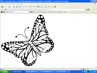
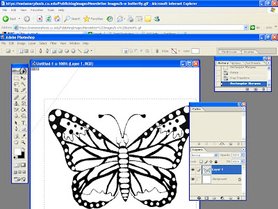
We then found a butterfly image on google images that we liked. We wanted to blend this into the middle of the panel.


We opened it up on photoshop on a seperate window and rotated it so it was upright. We also erased the background.


We then pasted it onto the panel and erased the black areas of the butterfly so it was left white. We then blended it into the background again so you could very faintly see it. After this we resized it to fit into the middle.


Finally we had to add the outline of where the cd would go. We just used the shape tool and got 2 circle shapes to outline where the cd would go.

This is what our final 2nd inside panel looks like...


Below is an image of our final digipak panels...