
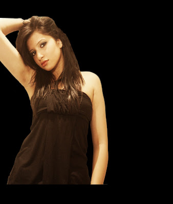
We want to use this picture on a black background and put it on the side of the page.
We have edited and adjusted the image to make it look clearer using the skin perfecting techniques again such as the blur tool and the smudging tool.
We then erased the background, copied and pasted it on a new black background. We positioned it to the side.
This is what it looks like so far.
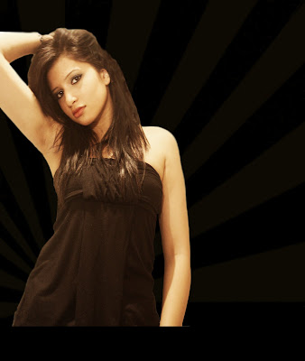
We then found an image to blend into the background so it wouldnt look too plain. It also draws attention to the artist image and the background looks like she (me) is shining. We blended the image into the black background and adjusted the opacity to how we liked it.
This is what it looks like so far.
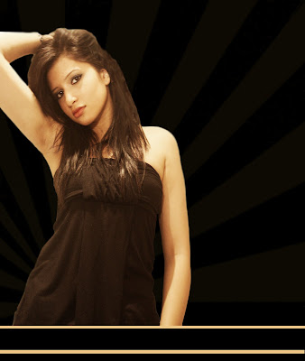
We then added 2 lines at the bottom of the page. This was because the photo of the artist is not touching the bottom of the page and it looks slightly odd. But we didnt want to move the position of the picture as we liked it there. We decided that we would put the 'out now' at the bottom of the page so we added lines to position where it would go. This is what it looks like now...
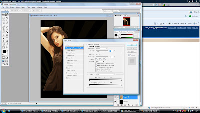
We thought that the artist image looks abit bare and we wanted it to stand out more. So we added an outer glow to the image.
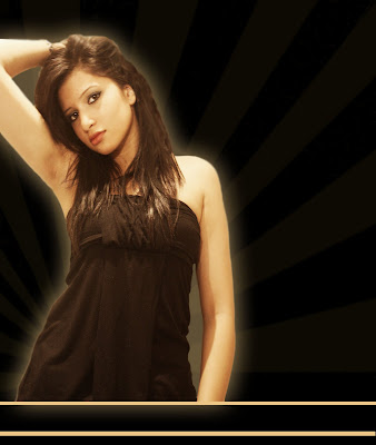
We thought that the magazine advert should match the digipak abit more so we added butterflies and blended it in the background of the magazine advert on the side, which looked like this...
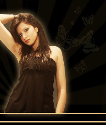
Now we had to add text to the magazine advert. We needed to include the conventions of the artist name, album name and when the alum/digipak would be release.
We used the same text that was on the digipak cover but we changed the colour to cream/beige. We positioned at artist name and the album name at the top of the magazine advert. We wrote 'Naina Kay presents You Made Me'.
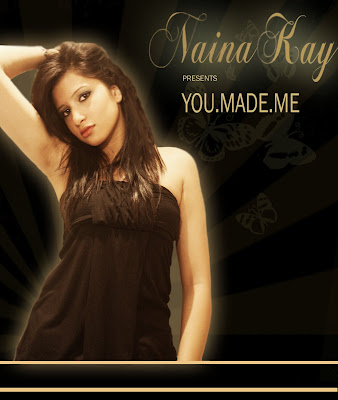
We then added when the album would be released at the bottom of the digipak, a wesite and what the digipak include.
This is what we ended up with, our final magazine advert...
