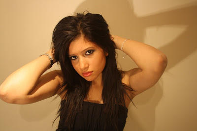
I wore makeup that was bright and bold to make my features stand out to the camera.

Her eyes and lips stand out the most, particularly for the 'male gaze'.
There is also evidence for this is..

This is Alicia Dixon, her makeup is also standing out. Her eyes are also smokey and bold and she is wearing lipstick, like me.
I looked at the makeup particularly for these artists because they are british artists that i have looked at previously for artist image research.
Using photoshop i have tried to adapt the pictures to make them suitable to use for our magazine/ digipak. I have use different effects such as black and white.

The picture above is one of the pictures we liked. It was uploaded on photoshop and i tried to make it look different and relate it to our genre. The pose and black and white effect was inspired by beyonce's album cover. However we are aware that we cannot copy this so we made it original by taking the picture from a side view instead of straight ahead. We also made the makeup and accessories coloured as a different effect which we think goes well with our genre.

Below is the original picture that was used.

I uploaded it onto photoshop. I cut the image and pasted it on a magazine sized page as a layer. I then edited the layer and made it black and white. I pasted another layer from the and kept it the same colour. I erased everything apart from the jewellry and accessories. Because there was another layer underneath that was black and white the erased parts showed this.
This was another picture we liked...

The original picture we took was this...

We changed the background of this using photoshop, this is how...
Presentation Picture
This is another picture that we had done, which we liked. The only thing we did here was make it black and white and photoshop. But we particularly like the pose, i am not looking straight at the camera and the camera positioning is good.
We had also experimented with other pictures, but we did nto particularly like them...

We found that this picture above was a good picture, we liked the way it looked. But we feel like it does not represent out genre. It looks more rock type and our genre is RnB so we decided that we cannot use this.

Also with this picture above we do not like the way it turned out overall. Personally i think it looked scary and canot be used for either a digipak cover or magazine advert. But we have learnt from this and are looking to develop this
differently.

This is another picture that i developed using photoshop. I had made the colours dull by changing the hue and saturation but i also added colour the the makeup on the face. This is a similar pose to one of our other pictures but it is a side view pose. We particularly like this pose for the magazine and digipak. However we could maybe change the effects on the photo as they could be seen as too dull for a magazine advert and digipak.
